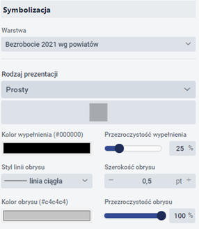
Symbolization
The user selects the {Symbolisation} button ![]() . The tools for symbolising the layer are displayed. The user selects {Presentation type}, which depends on the content of the layer.
. The tools for symbolising the layer are displayed. The user selects {Presentation type}, which depends on the content of the layer.
The user selects the {Symbolisation} button < img src="./images/icons/119_icon.png" width="25"/>. The tools for symbolising the layer are displayed. The user selects {Presentation type}, which depends on the content of the layer.
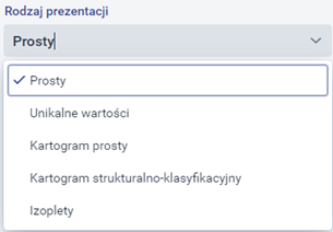
The type of presentation changes depending on the type of layer geometry.
Types of presentation for the point layer:
- Simple presentation - this is a simple depiction of a given geometry on a map,
- Unique values - the map presents a given geometry depending on the specific value of its attributes.
- Simple Choropleth map - consists of representing a given geometry according to defined ranges of values of its attributes. The Choropleth map shows the intensity of certain values very well, e.g. by using an increasingly intense colour. The Choropleth map works differently for each geometry.
- Map of clusters - a form of presentation available only for points, directly related to the so-called clustering of points - the more points in a given area, the stronger the given phenomenon (which is graphically illustrated precisely thanks to the above form).
- Simple Diagram map - allows the attributes of the geometry to be presented in the form of bar or pie charts.
- Structured and summary Diagram map - Refers to a map in which the quantity of a certain phenomenon is presented using diagrams. Types of presentation for the linear layer:
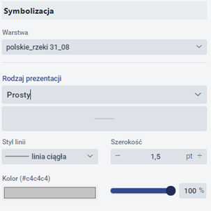
- Simple presentation - this is a simple depiction of a given geometry on a map.
- Unique values - the map presents a given geometry depending on the specific value of its attributes.
- Simple Choropleth map - consists of representing a given geometry according to defined ranges of values of its attributes. The Choropleth map shows the intensity of certain values very well, e.g. by using an increasingly intense colour. The Choropleth map works differently for each geometry. Types of presentation for the polygon layer:
- Simple presentation - this is a simple depiction of a given geometry on a map,
- Unique values - the map presents a given geometry depending on the specific value of its attributes.
- Simple Choropleth map - consists of representing a given geometry according to defined ranges of values of its attributes. The Choropleth map shows the intensity of certain values very well, e.g. by using an increasingly intense colour. The Choropleth map works differently for each geometry.
- Structural-classification Choropleth map - A composite Choropleth map showing two thematically related phenomena at the same time, the first one indicated by a colour and the second one by a grey.
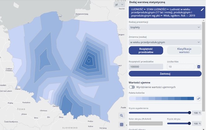
- Isopleths - involves presenting a line that depicts a function of two variables on graphs.
Presentation parameters
Depending on the chosen presentation method, the user has the option of adjusting parameters such as symbol type, colours, line thicknesses and types, compartments and much more. The individual parameters are described in detail below, in the different types of presentation.
Simple presentation
A. In the case of presentation for point geometry, the user has the option of specifying the symbolisation of objects and groups of points, the transparency of the layer and the visibility of objects.
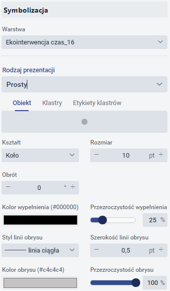
Symbolisation of layer objects (single symbol).
If a simple type is selected, it is possible to specify:
- Marker shape - there are 5 types of shapes to choose from: circle, square, rhombus, cross, cross. Its size and rotation can also be specified.

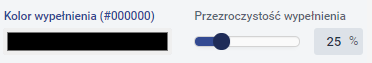
- Fill - the colour and transparency level of the marker fill can be selected.
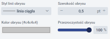
- Outline - you can select the line style, colour, transparency level and width of the marker outline line.
Symbolisation of groups of points (clusters).
The user has the option to enable Symbolisation of groups of points (clusters) by going to the {Clusters} tab and activating the ![]() switch. Points will then be clustered (grouped), i.e. points clustered in a certain area will show up as a single point.
switch. Points will then be clustered (grouped), i.e. points clustered in a certain area will show up as a single point.
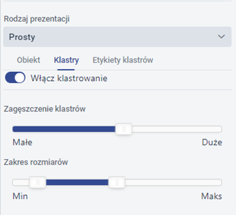
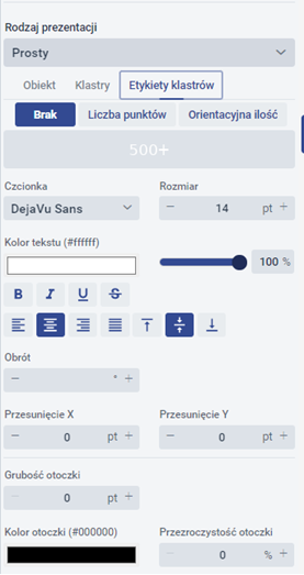
The user sets the clustering parameters. In the next tab, the user is able to configure the {Cluster label}. The user sets the font, its size, text colour, its parameters and position.
B. In the case of presentation for surface geometry, the user has the option of specifying object symbolisation, layer transparency and object visibility.
The user sets the following parameters:
- Fill - the colour (from the available colour palette) and transparency level of the polygon fill can be selected.
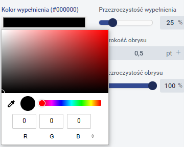
- Outline - line style, colour, transparency level and width of polygon outline lines can be selected.
C. In the case of presentation for linear geometry, the user has the option of specifying object symbolisation, layer transparency and object visibility.
The system generates a window in which the user can select the line style (continuous, dashed, etc.), colour, transparency and line width.
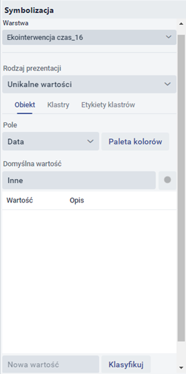
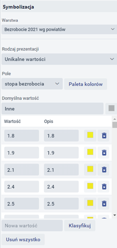
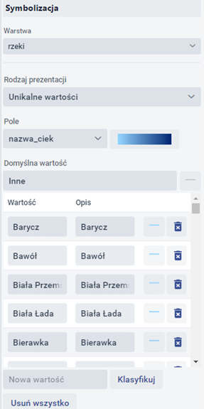
Unique values
A. In the case of presentation for point geometry, the user has the option of specifying the symbolisation of layer objects (unique values) and point groups.
Symbolisation of layer objects (unique values).
The system generates a window in which the user specifies:
- Field - the user specifies from which attribute (field) the map should retrieve data.
- Colour palette - the user selects from the available predefined palettes.
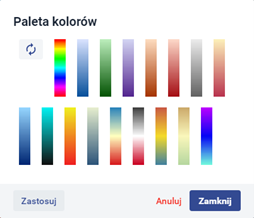
Once the colour palette has been selected, the user selects {Apply} and then {Close}. To display the layer, the user selects the {Classify} button.
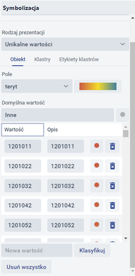
The user can add a new value by entering it in the [New value] field. The user can edit a field from the [Description] column. The user with the {Remove All} button - deletes previously added values.
![]() - Edit symbol - when the button is selected, a window is displayed in which the user can edit individual symbols.
- Edit symbol - when the button is selected, a window is displayed in which the user can edit individual symbols.
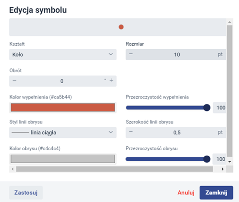
Once the changes have been made, the user selects {Apply} and then {Close}.
![]() - Delete - allows the selected value to be deleted.
- Delete - allows the selected value to be deleted.
Symbolisation of groups of points (clusters).
The user has the option to enable Symbolisation of groups of points (clusters) by going to the {Clusters} tab and clicking on the ![]() switch. Points will then be clustered (grouped), i.e. points clustered in a certain area will show up as a single point. The user has the option to set the density of the points in the clusters and their size, and to set the labels.
switch. Points will then be clustered (grouped), i.e. points clustered in a certain area will show up as a single point. The user has the option to set the density of the points in the clusters and their size, and to set the labels.
B. In the case of presentation for surface geometry, the user has the option of specifying object symbolisation, layer transparency and object visibility.
Symbolisation of layer objects
For the presentation for surface geometry, the parameterisation is very similar to that for points:
- Field - the user specifies from which attribute (field) the map should retrieve data.
- Predefined colour palettes are available to the user.
C. In the case of presentation for linear geometry, the user also has the option of specifying object symbolisation, layer transparency and object visibility.
Symbolisation of layer objects
The system generates a window in which the user specifies:
- Field - the user specifies from which attribute (field) the map should retrieve data.
- Palette - The user has predefined colour palettes available.
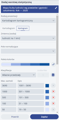
Simple Choropleth map
A. In the case of presentation for point geometry, the user has the option of specifying object symbolisation, layer transparency and object visibility.
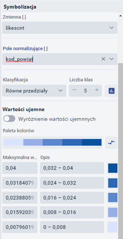

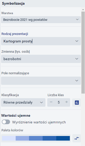
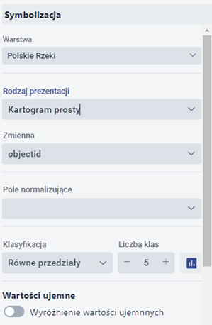
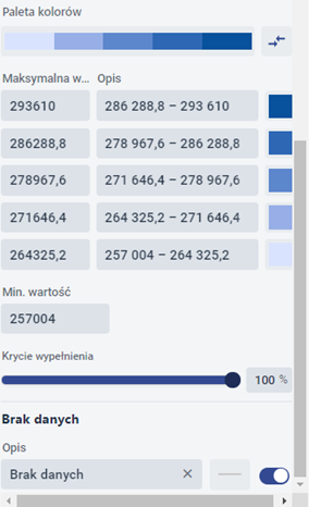
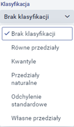
The user specifies the variable and the normalising field. He or she decides which classification will be performed (equal intervals, quantiles, natural intervals, standard deviation, eigenintervals) and specifies the number of classes. In addition, the user has a predefined colour palette available on the {Colour palette} tab. The user sets the cover percentage, outline colour and thickness.
B. When presenting for surface geometry, the user specifies the same parameters as for point geometry.

Symbolisation of layer objects (simple Choropleth map).
The user specifies the fields [Variable] and [Normalising field]. He then selects the method of classification (equal intervals, natural intervals, quantiles, own intervals, standard deviation) and the number of classes. In the next step, he selects the colour palette. The user can also define parameters: opacity, outline colour and outline thickness.


Symbolisation of groups of points (clusters).
The user has the option to enable Symbolisation of groups of points (clusters) by going to the {Clusters} tab and clicking on the ![]() . switch. Points will then be clustered (grouped), i.e. points clustered in a certain area will show up as a single point. The user has the option to set the density of the points in the clusters and their size, and to set the labels.
. switch. Points will then be clustered (grouped), i.e. points clustered in a certain area will show up as a single point. The user has the option to set the density of the points in the clusters and their size, and to set the labels.
C. When presenting for line geometry, the user specifies the same parameters as for point geometry.
Map of clusters
It is a dedicated representation for point geometry, related to the clustering of objects in a certain area. The more points there are in a given area, the stronger the effect and therefore the graphical representation - more intense. It is a highly illustrative presentation mode that can be used in a wide range of applications.
The user can specify:
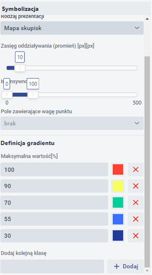
- Interaction range (in pixels) - specifies the radius of the circle to represent the interaction;
- Intensity - defines the level of minimum transparency;
- Field containing point weight - the user indicates the selected attribute (field) characterising the objects;
- Gradient definition - definition of the percentage to which the colour is to be applied. It is possible to define further positions or to delete existing positions. According to the scale shown in Figure 22, if the total area of the circles formed by the points on the map occupies respectively 30%, 55%, 70%, 90% or 100% of the area at a given level of approximation, this is represented in the example map (Figure 36) by the corresponding colours and their intensities.
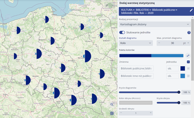
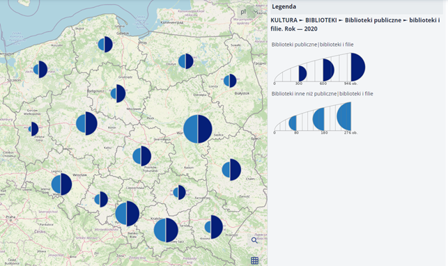
Simple Diagram map
The simple Diagram map, available for point and area geometries, allows graphs representing definable values to be displayed. The graphs are positioned at the centre of gravity of the given geometry.
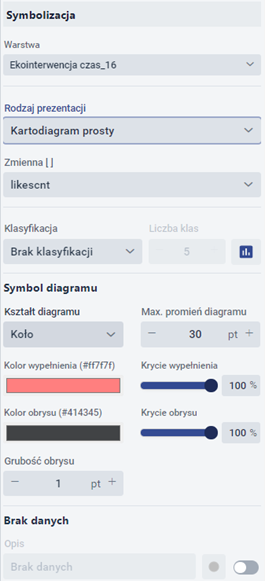
The user specifies:
- Variable,
- Classification method:
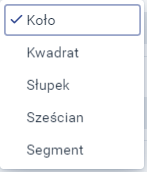
- Graph type: :
- Maximum diagram radius,
- Fill colour and opacity,
- Outline colour including coverage.
Structural and summary Diagram map
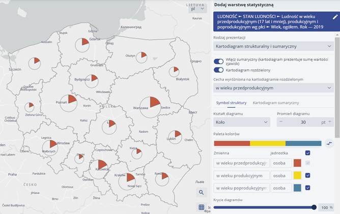
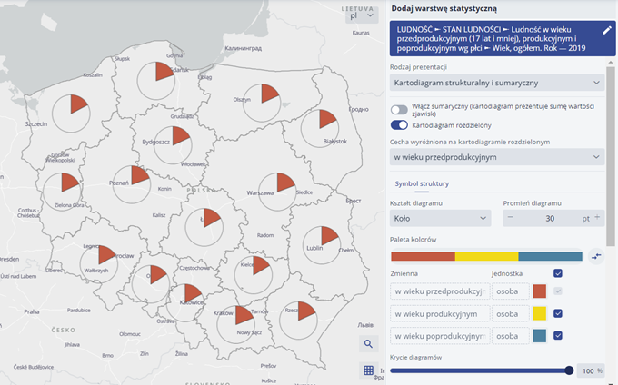
The structural Diagram map is used to present the elements of the structure of the phenomenon presented. It presents the structure of the phenomenon itself, without providing information on the size of the phenomenon. In this type of Diagram map, all diagrams are of the same size, while their interiors are subdivided according to the proportions of the individual elements of the structure. A Diagram map of this type serves to convey information about the structural distribution of a given phenomenon at a given point or field of reference and the proportions of the elements of its structure; however, it does not convey either information about the aggregate size of the phenomenon or information about the size of the individual elements of the structure. In structure diagrams, the individual components are always put down in the same order. The data used for this diagram must add up to 100%. Circular diagrams are most commonly used, in which the structure is deposited in the form of subdivided successive sectors, i.e. sections of a circle. The beginning of the division is taken to be the radius of the circle at the "12 o'clock position", while the division itself is made clockwise. The summary Diagram map (also called structural-summary or summarystructural) is a combination of the simple and structural Diagram maps. It depicts the structure of a phenomenon (the percentage of structure elements in the total phenomenon) combined with its magnitude. The diagrams here are of varying size depending on the total size of the phenomenon presented, with the structure of the phenomenon summed up to 100%. The diagram quantities can be presented continuously or in a stepwise manner (as a stepwise summary Diagram map). In addition, with the "Split Diagram map" switch, it is possible to use a structured split or summary split Diagram map. In this Diagram map, the entire structure of the phenomenon is not shown, only one element of it - only the diagram section (circle slice) corresponding to the structure in question is marked on the map. The sections have a radius that corresponds to the overall size of the phenomenon, and the radius of the circle at the "12 o'clock" position is taken as the beginning of the section. This method shows both the contribution to the overall phenomenon and the size of a particular element of the structure. In this Diagram map, two structure elements are actually presented: the selected structure element and the remaining structure elements together (as a complement to 100%), with only the selected structure element marked in colour.
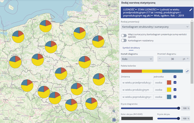
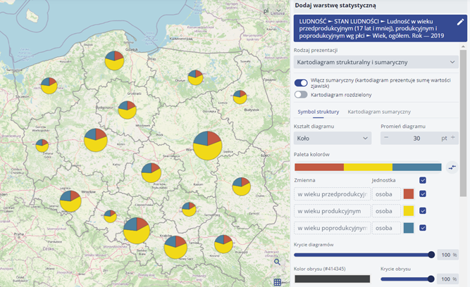
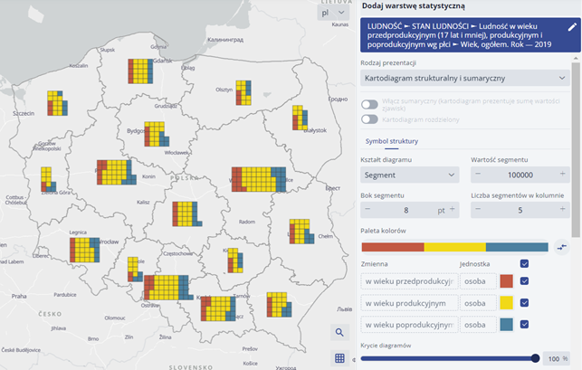
The user specifies:
- Shape of the diagram:

- The radius of the diagram in pt.
- Colour palette:

- Diagram opacity in %,
- Outline colour:

- Contour coverage in %,
- Thickness of the outline:

Diagram map
A Diagram map combines the features of a Diagram map and a Choropleth map. In a Diagram map, a phenomenon related to a point or area is presented in the form of a diagram (circle or square), whose area indicates the size of this phenomenon (as in a simple Diagram map). In addition, there is a colouring of the diagrams, to which another phenomenon is presented, thematically related to the phenomenon presented by the size of the diagrams.

When configuring the parameters for the Diagram map, it is possible to specify:
- variable, which contains the numerical values that determine the size of the diagram,
- classification method,
- diagram shape (circle or square), * maximum radius of the diagram; colour and outline cannot be determined. The colouring of the diagram can be defined in the "Choropleth map" tab, where typical Choropleth map parameters are available - i.e. the colour depends on the selected colour palette and the value of the selected variable. The contour parameters relate to the diagram contour and not to the reference area contour.
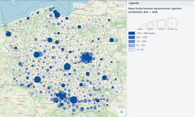
The Diagram map method can be used to create, for example, a map of population and population density in the counties:
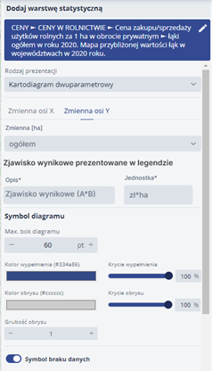
Two-parameter Diagram map
In a two-parameter Diagram map, a rectangular diagram is used whose individual dimensions relate to different statistical values allowing two phenomena to be presented simultaneously. In this diagram, the width represents one phenomenon and the height the other, suitably related to it. What is important here is that the two phenomena represented by the diagram are appropriately related, as they must be chosen so that their combined value, represented by the diagram area, represents another phenomenon. The surface of a two-parameter diagram represents a particular phenomenon, the components of which are rendered by the length and width of that diagram.
The values of the phenomena on the sides of the rectangular diagram are deposited linearly.
When configuring the parameters for the Diagram map, specify:
- variables containing the values of the x and y axes of the Diagram map,
- the name and unit of the resulting phenomenon,
- maximum side length of the diagram,
- colour, outline and fill coverage.

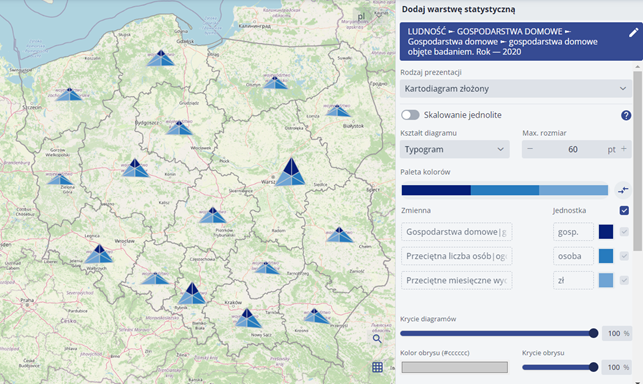
Composite Diagram map
The compound Diagram map method allows several phenomena to be represented simultaneously. Graphically, it can take different forms - it can be a bar diagram, a pie diagram, a square diagram or a typogram. Within this method, no differentiation of diagram shapes is used - all phenomena are represented by the same type of diagram. In a Diagram map, phenomena can be presented with the same or different denominations and, consequently, the same or differently scaled. In a composite Diagram map, both different phenomena and components of the structure of a single phenomenon can be represented and, unlike a structural Diagram map, the components of the structure need not add up to 100%. In compound diagrams, the individual features are always placed in the same order.
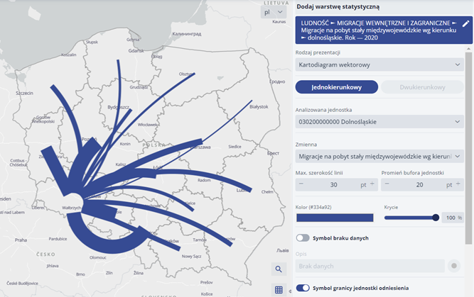
Vector Diagram map
A vector linear Diagram map is used to show the magnitude of a phenomenon occurring between different locations (intensity of the phenomenon along directions), and is used in cases where it is not expedient or possible to show the actual course of a line. The phenomenon occurring between two locations is presented in the form of a line (straight or arc) connecting the respective points. In this Diagram map, the course of the diagram line only indicates the fact of the link between the areas. The magnitude of the phenomenon is reflected by the thickness of the line.
A special version of the vector linear Diagram map is the bidirectional vector linear Diagram map. This version of the Diagram map makes it possible to present a phenomenon that has a specific direction. The magnitude of the phenomenon, as is the case with the usual linear vector Diagram map, is presented by using a line thickness proportional to its magnitude in each direction, with the associated line colour being used depending on the direction of the phenomenon.
Structural and classification Choropleth map
The structural classification Choropleth map makes it possible to present the structure of a tripartite phenomenon in the form of a Choropleth map while delineating the types of territorial units.
Only a phenomenon whose structure consists of three elements (representing 100% of the phenomenon) can be represented by this method.
In this Choropleth map, in order to determine the classes, the structure of the phenomenon must be deferred in a triangular coordinate system taking the form of an Osanna triangle; the elements of the structure are deferred on each axis (scaled from 0 to 100%).
Based on the division of Osann's triangle, individual unit types (classes) are determined. A subdivision into 6 unit types (classes) based on the mean value for the entire data set was used.
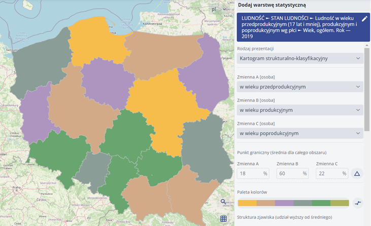
The user specifies the Choropleth map parameters and selects the colour palette.
Isopleths
The isopleth method uses lines drawn on a map to present a phenomenon, connecting points of equal numerical value of the phenomenon. This method is used to present phenomena occurring continuously in a given area (this continuity may be conventional), characterised by variations in intensity. Both relative and absolute data can be presented in this way. An isopleth is a line on maps interpolated from values for spatial units (e.g. administrative units). Isopleths represent the overall distribution of the intensity of a phenomenon, but are conventional constructs that do not aim to represent the phenomenon faithfully, but to draw attention to important features of its spatial distribution. Isopleths are plotted on the basis of values at reference points (surface centroids of reference units) using linear interpolation on the basis of a triangular grid formed by connecting neighbouring reference points